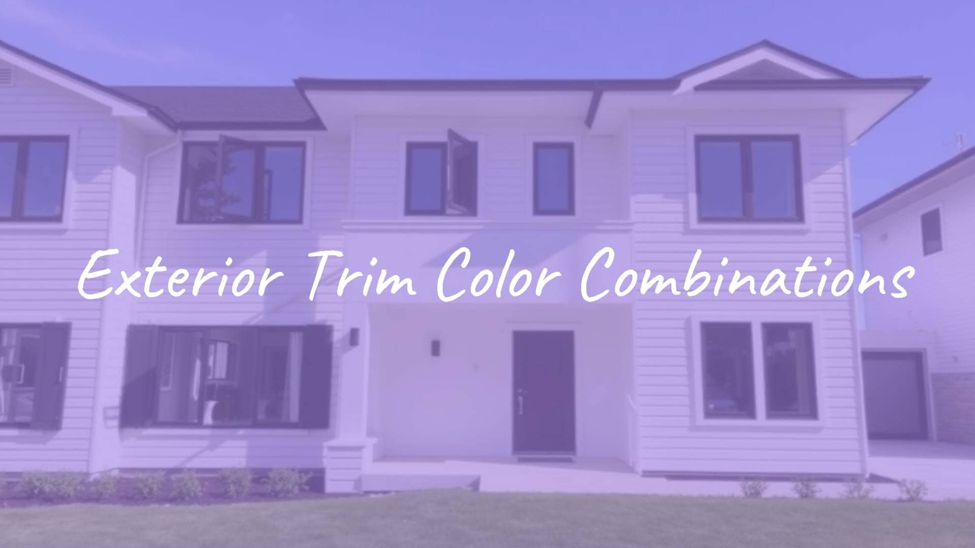
Exterior trim color combinations are the sets of colors you use on a home’s secondary details-like window frames, rooflines, and door casings-to work with the main siding and create a unified look. When chosen well, these colors act like a frame around your house, calling attention to its best features and tying the structure to the yard and neighborhood. Whether you want a bold, high-contrast modern style or a softer, more traditional one-color look, the trim palette is key to a finished appearance.
Choosing the right balance takes more than grabbing a nice color chip; it means knowing how the 60/30/10 rule works on an exterior. In this design rule, about 60% of what you see is the main siding or brick, 30% is trim and secondary areas, and the last 10% is strong accent colors like the front door or shutters. Using these ratios well helps turn a basic house into one that really stands out and shows your personal taste, while still respecting the original architecture.

What Are Exterior Trim Color Combinations?
Which Elements Are Included in Exterior Trim?
Exterior trim covers the details that outline and define your home. This includes window casings, door frames, soffits and fascia along the roofline, and corner boards. It can also include smaller parts like window mullions, porch railings, and columns. Even gutters and downspouts are often painted to match or blend with the trim so they don’t grab attention where you don’t want it.

Trim also means the decorative pieces you see on certain styles, such as moldings and brackets on Victorian or Craftsman homes. When planning colors, designers also study the parts of a house that won’t change, like roof shingles, stone foundations, and the mortar in brickwork. Matching your trim to the mortar color, for example, is a simple way to create a smooth, unified look that gently links masonry to wood or vinyl siding.
How Do Trim Colors Impact Home Curb Appeal?
Trim has a big effect on curb appeal; it can make a home feel open and welcoming, or broken up and old-fashioned. A clean white trim, like Benjamin Moore’s White Dove OC-17, can brighten darker siding and make the house stand out against green grass and trees. On the other hand, dark trim such as Charcoal Slate HC-178 on a neutral body color can add a modern, strong look that highlights straight lines and bold shapes.
Trim colors also help tie different accents together. For older or traditional houses, using similar colors for trim and siding can make the home feel fresh and updated. Picking a trim color just a bit lighter or darker than the body color gives you a soft, calm effect where the outline of the house is clear but not harsh. Careful color coordination is often what makes a home look like a designer planned it.

How to Select the Right Exterior Trim Color Combinations
Consider Architectural Style and Home Materials
Your home’s style should guide your first choices. A classic Colonial or Cape Cod often looks best with time-tested pairings like blue siding with bright white trim, while a Craftsman bungalow often suits earth tones such as olive green or deep brown. Brick and stone matter as well. For example, if you have Magnolia brick with a mostly white face and brown base, trying blacks or dark browns on the trim can create a strong and coordinated contrast.

The surface texture of your siding-smooth vinyl, rough stucco, or natural wood-also changes how colors look. Stucco exteriors often do well with warm whites like White Chocolate OC-127, plus dark green shutters for a coastal or Mediterranean feel. Look for patterns in your architecture; homes with a modern or industrial feel often look great with black or bronze window frames to underline that style.
Coordinate with Main Siding and Accent Colors
Good exterior color plans usually have one main “hero” color with supporting colors beside it. If the siding is bold, trim usually works best as a calm neutral so the house does not feel too busy. For popular neutrals like Revere Pewter HC-172, trim in Swiss Coffee OC-45 can help connect both warm and cool tones. The idea is to let the trim back up the siding, not compete with it.
Remember the 10% accent area for your front door and shutters. Many people match shutters to the trim, while others pick a color that’s a bit darker or lighter to show some personality. For example, a home with light beige siding and brown trim might have a deep navy front door for added interest. Layering colors this way gives depth and keeps the exterior from looking plain or flat.
Factor in Surrounding Landscape and Lighting
Your yard and nearby scenery act like a constant backdrop. A house surrounded by evergreens can look beautiful with “almost-neutral” greens like Hampshire Gray HC-101 that echo the trees. Homes with wide lawns often find that cool gray siding and trim make the grass look even greener. Location matters too: in the Northeast, whites, grays, and blacks are common choices, while tropical areas often favor brighter, sun-faded colors.
Lighting is one of the trickiest parts of picking colors. The direction your house faces and the amount of shade from trees can change the way a color appears. A paint color under a big shade tree will look much darker than the same color in straight sun. Natural light also changes from cooler in the morning to warmer in the evening, so your trim color needs to look good throughout the day.
Test Samples in Different Lighting Conditions
Avoid choosing a trim color only from a small paint chip or computer display. Many pros suggest using brush-on samples-like Benjamin Moore’s 8 oz. samples-and painting them onto large white foam boards. Move these boards around your home’s exterior to see how each color looks next to your siding, brick, and plants at different times of day. This “site panel” method is one of the best ways to see real color changes and prevent costly errors.
Check the samples in the morning, at midday, and at dusk. You may notice that a white that seemed pure in the store suddenly looks yellowish or bluish when placed beside your roof. Viewing colors on-site gives you the confidence to move ahead with a full paint job, so the final look lines up with what you had in mind.

Trending Paint Colors for Exterior Trim
Classic Whites and Creams
White is still the top choice for exterior trim because it always makes a house look clean and cared for. Colors like Simply White OC-117 and Arctic White give crisp detail that works with almost any siding. If stark white feels too strong, soft whites like White Dove OC-17 or Swiss Coffee OC-45 offer a gentler look that works well with warm and cool color schemes.
Creams and off-whites are especially good on stucco or brick homes. For example, White Chocolate OC-127 on stucco with dark green trim gives a stylish, upscale look. Light shades can also help a small house seem bigger and more open when viewed from the street.
Soft Grays and Cool Neutrals
Grays are now a basic choice in modern exteriors and offer a flexible option besides white. Light grays like Stonington Gray HC-170 or Silver Gray 2131-60 give a clean, current look with gentle blue-green notes. These colors are great for freshening up common styles like Cape Cods and Colonials so they feel more current while still classic.
Cool neutrals such as Gray Owl OC-52 are often used as trim on homes with white or light gray siding to create a smooth, single-color effect. This kind of scheme keeps the eye on the shape of the house instead of on sharp color breaks.
Bold Contrasts: Black and Charcoal
For homeowners who like stronger looks, dark trim is a strong and growing trend. Black HC-190 and Iron Mountain 2134-30 are popular for sharp contrasts with white or pale gray siding. This works especially well on modern farmhouses or industrial-style homes where you want windows and rooflines to stand out as bold, graphic details.

Charcoal colors like Kendall Charcoal HC-166 give a slightly softer but still dramatic feel. These darker tones pair well with many siding colors-from deep blues to warm tans-and give the house a grounded, solid appearance.
Earthy Tones and Naturals
Earthy trim colors such as Carrington Beige HC-93 or Monroe Bisque HC-26 are great for a warm, natural feel. These often have light green or gold hints that help the home settle into wooded lots or desert views. With tan or beige siding, these trim colors can mimic the look of real wood beams and add a sense of age and hand-crafted detail.
Natural tones also shine on homes with stone or brick. Pulling a secondary color from the stone-like taupe or warm sand-creates a calm, balanced mix that feels intentional. You see this approach often on Craftsman and Mediterranean houses.
Accents: Blues, Greens, and Uncommon Choices
Neutrals may dominate the trim market, but many designers are turning to softer blues and greens as “new neutrals.” Sage greens like Louisburg Green HC-113 give a mossy, natural look that pairs nicely with cream or white siding. For a bolder style, teal and white are growing in popularity and update the classic nautical blue-and-white theme.
Less common colors such as Raspberry Blush 2008-30 (a former Benjamin Moore Color of the Year) or deep burgundy like Sweet Rosy Brown 1302 can work well on doors and shutters for a strong punch of color. These shades usually look best when the main trim stays fairly neutral so the bright accent clearly stands out.
Popular Exterior Trim Color Combinations by House Color
White House Trim Ideas
A white house is a flexible base, but the trim choice sets the overall feel. For a modern, simple look, white-on-white (for example, Arctic White siding with Arctic White trim) creates a smooth, clean exterior. To add warmth, pairing white siding with tan or beige trim can make the home feel more relaxed and welcoming.
For stronger contrast, black trim on a white house is a long-loved pairing. This “tuxedo” style outlines every opening and makes a striking statement on both farmhouses and sleek modern homes. Add a red front door to this mix for a classic finishing touch that has never gone out of style.
Blue House Trim Pairings
Blue houses are a traditional favorite, and white trim is their most common match. Whether the siding is deep navy or a pale gray-blue, bright white trim gives a fresh, coastal feeling. For a newer look, blue siding with gray trim softens the contrast and gives homes like Colonials a more modern and polished feel.
Some homeowners are also trying layered blue schemes. Using dark navy trim with medium blue siding provides depth without the sharpness of white. This works especially well in coastal areas where the home reflects the sea and sky around it.

Gray House Trim Options
Gray siding is very popular because it makes a strong visual statement. For dark grays like Iron Gray, clean white trim is the usual choice to lighten the look. For a sleek, one-color feel, using several shades of gray together can look very stylish. Black trim with gray siding and gray shutters, for example, can pull an older house into a very current, high-style look.
If you like a warmer gray, choose trim with “greige” (gray-beige) tones. This helps connect cool gray siding with warm features like a wood front door or stone chimney. Gray works well with many other colors, making it one of the easiest siding colors to match with trim and accents.
Beige and Tan House Trim Combinations
Beige and tan homes work best with nature-inspired palettes. A tan house with beige trim creates a gentle, blended look that calls to mind natural wood and stone. This pairing is especially good for Craftsman and Bungalow homes that aim to feel grounded and part of their surroundings. To add more shape and interest, you can use deeper brown trim to outline rooflines and windows.
To keep a beige house from feeling dull, add a strong accent color. Blue shutters or a deep green front door can look great against sandy tones. This keeps the neutral scheme interesting without losing its classic feel.
Green House Trim Matches
Green siding, once seen as old-fashioned, is now back in style. Gray-green siding looks sharp with bright white trim for a clean, current appearance. For a more traditional forest look, deep greens with blue hints, such as Caldwell Green HC-124, pair nicely with off-white or tan trim.
For a cottage-style contrast, try sage green siding with white trim and red shutters. This mix feels cheerful and classic at the same time. Green can be either warm or cool, so pay close attention to the trim undertones so everything works together.
Red or Brick House Trim Suggestions
For red siding or classic red brick, beige trim often works better than pure white. Beige warms and lightens the red without creating a barn-like look. When working with brick, matching the trim to the mortar color is a simple way to get a calm, unified result. For instance, ivory mortar with ivory trim gives a balanced, pulled-together appearance.
Darker brick also pairs well with dark trim such as black or bronze for a more modern, industrial look. Deep teal or muted green accents also look great with red brick because these colors sit across from red on the color wheel, which creates natural balance and interest.
Dark and Black House Trim Strategies
Dark exteriors are stylish and more flexible than many people think. Using a strong color like Black HC-190 for both siding and trim creates a bold, all-over look that highlights the shape of the home. To keep it from feeling too heavy, many people choose dark siding with white trim, such as White Dove OC-17, to break up the mass and show off the details.
Another approach for dark homes is to use very deep browns or near-black shades like Dragon’s Breath 1547. These colors add drama and look especially good beside full, green landscaping. With darker colors, paint sheen matters more; Low Lustre or Satin is usually best for both siding and trim to give a soft glow without too much shine.
Matching Exterior Trim with Shutters, Doors, and Other Accents
Should Trim Match Shutters or Doors?
There is no strict rule that trim must match shutters or doors, though many people like this simple and unified look. Using the same color on shutters and the front door can create a clear accent color that stands out from both trim and siding and gives the front of the house a steady rhythm.
Picking shutters that are a shade lighter or darker than the trim can add gentle contrast and a bit of personal style. The front door is usually the best place to do something different. Because it is the main focus on the front of the house, a bold, contrasting door color-like bright red or deep forest green-can show your personality and draw the eye straight to the entry.
Tips for Creating Cohesive Color Schemes
To build a unified scheme, start with what you can’t change. Look closely at the colors in your roof, your foundation stone, and even nearby houses. A good palette looks right on its own and also fits the surroundings. Digital tools like the Benjamin Moore Color Portfolio® app can help you see your home in different colors before you start painting.
Keeping paint sheen consistent also helps your house feel put together. Siding and trim often use Low Lustre or Satin, while the front door can be Semi-Gloss or High-Gloss so it stands out. Painting trim, soffits, and gutters the same color and sheen helps the outside frame of your home feel solid and planned instead of mixed and random.
Common Mistakes to Avoid in Exterior Trim Color Selection
Overlooking Undertones and Finishes
A common mistake is ignoring undertones in a color. A white that looks perfect in the store may turn pink, blue, or green when painted outside, clashing with warm brick or a cool roof. Decide if your overall palette is warm or cool and stay with that choice. Mixing a cool gray trim with a very warm yellow-beige siding, for example, can make the whole house feel off.
Paint finish matters just as much. High-gloss paint on large trim areas can show every dent and flaw in the surface. Many experts suggest a Low Lustre or Pearl/Satin finish for trim so it holds up well, looks fresh, and doesn’t reflect too much light.
Ignoring Neighborhood or HOA Guidelines
Before you settle on a final color plan, check with your Homeowners Association (HOA) or local rules. Many areas use pre-approved colors to keep a certain look along the street. A bold combo like teal and bright white might be stylish but could lead to fines or repainting if it breaks local standards.
Even without an HOA, think about the rest of your block. A color scheme that looks great by itself may clash if nearby houses all use quiet, traditional palettes. You still want your home to show who you are, but choosing colors that work with nearby homes helps boost the overall curb appeal of the whole area.
Choosing Colors Solely Based on Small Samples
A tiny color square on a card is nothing like paint spread over a tall wall or long roofline. Small samples can’t show how sunlight, shade, and angles change the color. A soft off-white on a chip might look harsh and glaring in direct sun.
To prevent this, use large samples and place them on different sides of the house. Check colors on the north face (cooler, bluer light) and the south face (warm, direct light). Taking this extra step is the only reliable way to see if the color you loved in the store works on your actual home.
Frequently Asked Questions about Exterior Trim Color Combinations
What Is the Most Timeless Trim Color?
White is often seen as the most timeless trim color. It has been used on American homes for centuries, from early Colonials to today’s farmhouses. Shades like Benjamin Moore’s White Dove OC-17 remain favorites because they look clean and fresh with almost any siding color and can make a home appear larger and better cared for.
Beyond white, neutral grays and blacks have also proven to last. Black trim on a white or light gray house has stayed popular through many design trends. These strong contrasts are respected for their simple, classic look and their ability to highlight a home’s structure.
Can You Mix Warm and Cool Tones?
Mixing warm and cool tones can work, but it takes careful planning. Most of the time, it’s easier to stick to one temperature for your entire scheme. Some colors, like Revere Pewter HC-172, are made to sit between warm and cool and help bridge them. If you have warm brick and want cooler gray trim, choosing a gray with a bit of brown or “greige” in it can help both work together.
The main risk is pairing pure cool tones (like a blue-based gray) with pure warm tones (like a yellow cream). They can make each other look dull or dirty. If you are unsure, use your fixed elements-roof, stone, brick-as the guide for whether your palette should lean warm or cool.
Does Trim Color Affect Home Value?
Yes, trim color can strongly affect home value because it plays a big part in curb appeal. Curb appeal shapes a buyer’s first impression, and a modern, well-matched color scheme suggests the home has been carefully looked after. Old, peeling, or clashing trim colors can put buyers off and lead them to expect problems inside.
Spending money on good exterior paint that protects the house-like Benjamin Moore’s Aura® Exterior or Element Guard®-helps the look and also guards against weather damage and wood rot. A fresh, attractive color mix makes a home more appealing in a crowded market and can help it sell faster and at a better price.
When you settle on exterior trim color combinations, remember your house is both a personal statement and a major investment. Think about the strength and life of the paint you choose as well as the color. High-quality acrylic paints resist fading, cracking, and peeling, which matters even more on dark trim that soaks up more heat. If your home has special surfaces like vinyl siding or stucco, use paints made for those materials so the finish lasts. Taking time to coordinate trim, gutters, and downspouts with the main siding will give your home a clean, designer-style look that highlights its character for many years.


![What to with Scrap Metal? [infographic]?](https://facts-homes.com/wp-content/uploads/2019/07/645413-POPYOV-391-120x86.jpg)


