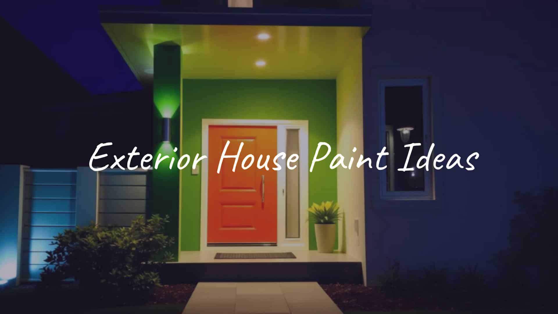
Exterior house paint ideas act like a clear plan for how your home looks from the street. They can range from a simple white farmhouse with black shutters to a sleek charcoal modern home in a single dark shade. To pick the best colors, think about your home’s style, how sunlight hits it during the day, and what surrounds it. When you mix your personal taste with strong, weather-resistant paint, you get a finish that looks great and stands up to time.
Choosing a color is more than picking something “pretty.” It tells a story. Maybe you want to honor a 1920s bungalow with a bright “lipstick-red” door, or make a tiny cottage feel larger with soft pastels. The right paint scheme increases curb appeal in a big way. This guide walks through many ideas, from earthy neutrals to bold dark shades, to help you give your home’s exterior a fresh look.

What Makes a Good Exterior House Paint Idea?
Curb Appeal and First Impressions
Your home’s exterior is the first thing people see, like a greeting. It shapes how others see the property and can affect how valuable it looks. In Fairfield, Connecticut, for example, one family turned a 1917 cottage from a faded light yellow into a refined gray. That single change made the white fence, window boxes, and brackets stand out, showing how the right base color can highlight your home’s best details.
Curb appeal is about finding the right mix of standing out without clashing. Good colors work with their surroundings, not against them. A house with “Deep Sea” teal siding and a dark red stairway can be bold and interesting without feeling too loud. The goal is a warm visual welcome that feels thoughtful and neat, so anyone walking by or visiting gets a sense of your home’s character before they step inside.
Influence of House Architecture and Style
Your home’s structure should guide your color decisions. Symmetrical homes like Georgian or Colonial styles feel formal and traditional. They usually look best with light main colors and darker accents, which keep that classic feel. A large Colonial built in 1919, for instance, might only truly shine in a black-and-white scheme that fits its grand shape.
On the other hand, Craftsman homes, with detailed woodwork and stone, look best in soft, earthy shades. Colors such as “Renwick Olive” or “Cut the Mustard” let the natural materials stand out instead of fighting them. Victorian “painted ladies” famously use several colors to show off every trim and detail. When you pay attention to your home’s style, the paint feels like it belongs there instead of looking like a costume.

Neighborhood and HOA Considerations
Personal style matters, but your house also sits within a wider setting. Before you buy paint in a strong new color, check any neighborhood rules or HOA guidelines. Some areas limit exterior colors to keep the street looking consistent and calm. Even if there are no rules, picking a color that works with nearby houses shows care and good taste.
Being considerate doesn’t mean going bland. You can still add personality. Try finding a “shared thread” with other houses or the landscape. If most neighbors use neutrals, you might choose a smart “Greige” for the siding and a standout “Raisin” purple door. That way, your home feels unique but still fits its surroundings and adds to the overall curb appeal of the block.
Effect of Natural Lighting and Surroundings
Sunlight changes how paint looks more than almost anything else. A cream on a small store swatch can turn into a bright, sharp white in full noon sun. Light also shifts by direction: north-facing fronts can make colors look cooler and darker, while south-facing ones often wash them out. That’s why testing samples outdoors-ideally on a white foam board you can move-is such an important step.
Your setting matters too. A house in a green, wooded area might look best in soft greens or taupes that blend with the trees and ground, creating a calm feel. A desert ranch in bright, open land may stay cool with crisp white walls and chocolate-brown trim. By noticing the sky, plants, and even the soil around your home, you can choose colors that feel steady and natural.
How to Choose Exterior House Paint Colors
Evaluating Color Undertones and Light Reflection
Every paint color has an undertone-little hints of blue, green, yellow, or pink that show up more on big surfaces. Paying attention to undertones helps everything work together. Benjamin Moore’s “Swiss Coffee,” for example, leans warm, while “Gray Owl” is cooler. If your brick or stone has warm orange-red shades, a cool blue-gray might clash, but a warm beige or creamy white will blend nicely.
Light Reflectance Value (LRV) is another useful detail. It measures how much light a color bounces back. Light colors with high LRV reflect more heat and light, which can help homes in hot, sunny areas. Dark colors absorb more heat and can feel cozier in cooler climates. Once you know how a color handles light, you can decide if you want your home to feel airy and open or grounded and snug.
Considering Climate and Regional Weather
Your climate should strongly influence both the product and the color you pick. In the Northeast, many people choose classic blacks, grays, and whites that look good year-round. In humid or rainy places, choose mildew-resistant paint and colors that don’t show dirt easily. A mid-tone gray or soft mossy green, for example, can hide grime better than bright, pure white.
Regional style also shapes what feels natural. Coastal homes often use light aqua, sand tones, and soft pinks that echo the beach and water. In the Southwest, rich terracotta, rust, and warm sand shades reflect desert scenery and flatter stucco and stone. When your colors reflect local style, your home feels like it belongs where it is.

Durability and Maintenance
Painting the exterior costs time and money, so you want it to last. Quality paints like Benjamin Moore’s “Aura” or “Regal Select” are made to handle sun, rain, and temperature changes, resisting fading, cracking, and peeling. Dark colors can look dramatic but usually fade faster in strong sun than lighter neutrals. Many pros suggest repainting every 5-10 years, but premium lines with features like “Color Lock” can stretch that cycle.
Think about upkeep too. A white house with detailed trim looks beautiful but may need more frequent washing and touch-ups. If you want something easier, earthy neutrals like clay and taupe hide dirt and scuffs well. In damp areas, paint with built-in mildew resistance helps your home keep that “just painted” appearance longer.
Coordinating Paint Colors with Landscape and Outdoor Features
Your exterior includes more than just walls-decks, fences, and gardens all play a part. A thoughtful plan ties these elements together. Experts at Farrow & Ball suggest pulling a color from your plants-for example, using a “Cinder Rose” patio set that echoes pink hydrangeas nearby. This creates a gentle, pulled-together look outdoors.
Fixed features like the roof, driveway, brick, and stone are your anchors. If you have striking stonework, a deep blue shutter can add character without competing with the stone. A home in a wooded lot might pick up cool greens from the trees and pair them with “Cool Green” and “Butter Yellow” paint to blend right in. When your landscape and house colors work as a team, the result feels calm and complete.
Balancing Trends and Timelessness in Color Selection
Trendy colors can be fun, but exterior paint will stay up for years, so timeless choices matter. Deep charcoals, espresso browns, and black exteriors have gone from fad to standard in modern design, especially with light wood or metal accents. If resale value is a concern, classic neutrals like gray, beige, and white usually appeal to more buyers.
A smart way to use trends is in smaller areas. Keep the main body a neutral like “Greige,” then add “Dusty Lavender” or “Aegean Blue” to the door and shutters. That way, you can refresh accents without repainting the whole house later. A bold “saturated yellow” might be striking on a front door, while a soft gray on the siding keeps the full look calm and refined.
What Are the Most Popular Exterior Paints and Finishes?
Top Brands and Their Signature Exterior Colors
Major brands like Benjamin Moore, Sherwin-Williams, Behr, and Valspar lead the way in exterior paints. Benjamin Moore’s “White Dove” is well-known for its soft, flexible white, and “Revere Pewter” works nicely between warm and cool grays. Sherwin-Williams favorites include “Pure White” and “Tricorn Black,” which are often used for the clean, high-contrast modern farmhouse look.
Behr and Valspar offer budget-friendly but strong options, such as “Swiss Coffee” and “Ultra Pure White.” For a more “boutique” feel, Farrow & Ball’s 132-color range includes shades like “Inchyra Blue” and “Green Smoke,” praised for how they respond to light. These brands provide both the color and the advanced formulas needed to keep those shades steady through sun, rain, and snow.
Choosing the Right Sheen: Matte, Satin, or Gloss
Paint sheen affects both appearance and performance. Flat or Low Lustre finishes are common for siding because they hide bumps and flaws in wood or masonry. For trim, shutters, and doors, many people prefer Pearl or Satin. These give a slight shine that highlights details and are usually easier to wipe clean than flat finishes.
Semi-Gloss and High-Gloss are best for front doors and special accents. A “Full Gloss” black door can look very sleek and reflect light like glass, but glossy surfaces show every ding and need careful prep. Often, a mix works best: Flat for the main walls and Satin for the trim gives a good blend of style and practicality.
Paint Durability and Weather Resistance
Today’s exterior paints are built to last. Products like Benjamin Moore’s “Element Guard” are made to handle heavy rain and high humidity and perform well even on vinyl siding. Quality acrylic paints allow moisture from inside the walls to escape while stopping rain from soaking in, which helps prevent peeling and bubbling.
Protection from UV rays is also key. Advanced pigments keep their color strength, even in bright sunlight, and many premium lines include additives that resist mildew, especially useful on shady sides of the house. Choosing a paint with long-lasting protection means you’re also helping shield the structure of your home itself.
Popular Exterior House Paint Color Combinations
White and Gray Pairings
White and gray together are classic and clean, and suit many home styles. On a 1935 house, you might see “Spanish White” siding with “Rodeo” gray shutters and a “Northern Cliffs” front door for a neat, timeless feel. This combo is great for anyone who wants neutrals that still feel intentional and layered.
In newer designs, a soft gray exterior can cool down a very green yard, while white trim brings out roof shapes and garage or carriage doors. Valspar’s “Du Jour” and “Beguile” are good examples of gray tones that add depth without needing bold colors. This pair is safe but never dull when the specific shades are chosen carefully.
Classic Black and White
Black and white together are strong and lasting. This pairing is the standard for many modern farmhouses, with “Ultra Pure White” siding and “Carbon” or plain black trim for sharp contrast. It works just as well on big Colonials as on small cottages, keeping them both traditional and fresh.
To avoid a harsh or flat look, designers often introduce a third accent color. A “vibrant gold-green” or “spicy red” front door can soften the black-and-white and add warmth. Many 1910-1920 Georgian homes use soft grays, black, and white together to create a refined, current look that still respects their history.

Earthy Neutrals and Greige Tones
“Greige,” a mix of gray and beige, has been popular for good reason. Shades like “Mega Greige” and “Warm Stone” feel natural and grounded and pair well with stone or brick. These colors often mirror the tones already present in those materials, tying everything together.
Earthy color sets feel warm and welcoming. Using “Taupe,” “Beige,” and “Brown” together can create a sun-washed appearance that suits many landscapes. You can then add a “raisin-purple” front door for just enough drama without overwhelming the house. These colors are also easy to live with because they don’t show dust and wear easily.
Bold Blues and Navy Accents
Blue is a strong choice for color lovers who still want a classic look. A navy house with white trim and a red front door is a traditional East Coast favorite. Deep colors like “Hale Navy” or “Deep Sea Dive” give a rich backdrop for white railings, window boxes, and fences.
If you prefer something softer, gray-blues like “Boothbay Gray” or “Wedgewood Gray” create a calm, cool exterior. These work especially well near the water or on lots with big lawns, where they help the green landscape stand out. From “royal blue” to “pale aqua,” blue offers many ways to add personality without feeling wild.
Warm Beige and Cream Palettes
Warm beiges and creams give homes a soft, friendly, and classic look. Colors like “White Chocolate” or “Homey Cream” add a buttery warmth that feels sunny and cheerful. These shades are common on traditional houses, usually paired with slightly lighter trim for gentle contrast that doesn’t read too stark or cold.
Warm neutrals also show off textures like stucco or wood grain nicely. Using two related beige tones can break up a flat wall and add interest. Often, this “warm country” look is finished with a darker roof and light accents for a balanced, cozy feel.
Nature-Inspired Greens
Green suggests peace and balance, which is ideal for homes that want to blend into nature. “Louisburg Green,” a muted tone with a mossy feel, brings a forest mood to the exterior. Shades like sage, olive, and forest green echo trees and plants, which is perfect for Craftsman homes and houses surrounded by foliage.
A “green-gray” base pairs well with creamy white trim, which outlines the house without yelling for attention. For a fun twist, a soft pine green body with sky-blue accents can feel both classic and playful. Green is a great middle ground if you want more life than gray or beige but still mostly neutral.
Striking Reds and Terracottas
Reds and terracottas suggest warmth and tradition. A “ruby-red” door on a Tudor house sets off the dark wood beams and white plaster, adding a storybook charm. On Spanish or Mediterranean homes, deep terracotta and rust tones highlight stucco surfaces and blend into sunny, dry landscapes.
These shades are bold but grounded. Colors like “Currant Red” or “Cavern Clay” make a house feel lively and inviting. A whole red house is rare and daring, but using red on doors, shutters, or a stair rail is a stylish move that instantly grabs attention at the curb.
Unique Pastels and Soft Hues
In beach towns and historic areas, pastels can feel both fun and grown-up. A “pale pink” door and matching shutters can add charm to a white stucco Tudor. A “soft peach” with warm white trim can mimic the look of a quiet desert sky at sunset.
Softer tones like “dusty lavender,” “mint,” or “blush pink” are also showing up more often in suburban streets. They give a light, airy feel without shouting. When balanced with “slate blue” or “charcoal” trim, these colors gain a modern, grounded edge, perfect for a coastal bungalow or mid-century home.
Modern and Contemporary Exterior House Paint Ideas
Monochromatic Color Schemes
Monochromatic schemes use one main color for both siding and trim, often in different sheens. Deep blacks and charcoals, like Benjamin Moore’s “Black Satin” or “Iron Mountain,” are popular for modern homes that want a sleek, unified look. This draws attention to the home’s shape rather than the color breaks.
Monochromatic doesn’t have to mean dark. An all-white scheme can make a modern home look like a simple sculpture. Variation in texture (wood, metal, stucco, glass) provides interest where color normally would. This is especially effective on homes with strong lines and bold shapes that already speak for themselves.
Dark Exteriors with Light Wood or Metal Accents
Many newer homes use very dark siding with warm wood or metal accents. A matte black or charcoal body sets off cedar boards or copper details beautifully. The mix of natural wood with dark paint feels both rustic and urban, making it a favorite choice for updated farmhouses and hillside builds.
Light brown or honey-toned wood brings warmth to the dark paint. A “Charcoal” house with “Cedar Wood” trim and “Off-White” window frames, for example, feels both clean and inviting. The wood links the man-made structure to the trees, soil, and surroundings outside.

Contrasting Trim and Siding Colors
High-contrast trim and siding remain popular in modern design. A “sage green” body with “creamy white” trim and a “blush-red” door creates a crisp and current look. The trim acts like a picture frame, pulling attention to windows, roof edges, and the entryway.
Many modern homes use “Jet Black” with “Pale Gray” siding and “Copper” light fixtures for a dramatic mix. Contrast isn’t always just light versus dark-it can also be warm against cool. A cool gray house with a warm wood garage door balances both sides nicely, giving a high-end look.
Minimalist and Simplified Palettes
Modern minimalist exteriors usually stick with 2-3 related colors-often white, gray, and one accent like navy or deep green. This keeps the exterior looking calm and orderly. A “Stone Gray” home with a “Sky Blue” door and “Charcoal” roof is a good example: simple, city-ready, and balanced.
Minimalism often favors flatter sheens like matte or low lustre, which give a smooth, velvety look without shiny reflections. This lets the true color stand out and lets the architecture and yard do more of the visual work.
Architectural Styles and Recommended Paint Color Schemes
Farmhouse: White with Black Trim and Accents
The modern farmhouse look is everywhere, with bright white siding and black trim at its core. This sharp contrast highlights the home’s shape and gives that fresh, country feel. “Ultra Pure White” by Behr or “Pure White” by Sherwin-Williams are often used for the body, with “Black of Night” or “Carbon” for windows and shutters.
To keep the look from feeling too stark, many add a touch of color and natural texture. A “vibrant gold-green” or “cinnamon stick” front door can warm it up, and wood elements like beams or doors also help. Because the white is such a star, a strong, washable exterior paint is helpful to keep it looking bright.
Colonial: Deep Blue, Crisp White, and Red Door
Colonial homes have a long history, and their colors often echo that. A “Deep Blue” like “Hale Navy” with “Crisp White” trim and a welcoming red door is a classic combination. It suits the formal, balanced lines of center-hall Colonials while still feeling friendly.
Some people give this look a twist with royal or slate blues, white trim, and a butterscotch or rich brown door. Whether you stick with a “red, white, and blue” style or shift to softer shades of gray and black, Colonial houses usually look best in dignified, grounded color sets.
Craftsman: Earthy Green, Brown, and Beige
Craftsman homes celebrate wood, stone, and hand-made details. They look best in colors pulled from nature. “Moss Green” with “Beige” trim, for example, enhances shingles, beams, and stone bases. Soft tones like “Renwick Olive” or “Safari Vest” keep the eye on beams, brackets, and columns.
A gentle gray and white combo can also look welcoming, especially if you add a green on the porch floor or steps. Bright, artificial-looking colors usually fight with this style; earth tones help it feel like part of the surrounding yard and garden.
Mediterranean: Tan, Cream, and Terracotta Roof
Mediterranean and Spanish-style houses are made for sun. Their colors should reflect warmth and light. “Tan” and “Cream” shades like “White Chocolate” or “Dromedary Camel” pair nicely with terracotta tile roofs. These tones highlight stucco texture and classic arches and ironwork.
To add interest, designers often use deep red and light brown on doors, beams, or balcony rails. A bright “Mediterranean Blue” on the front door or gate can bring in a seaside touch, like homes along the coasts of Greece or Spain. Overall, the palette feels sunny, relaxed, and resort-like.
Modern: Charcoal, Cool Gray, and Natural Wood
Modern homes often lean on simple, industrial-leaning color sets. “Charcoal” and “Cool Gray” give a sharp backdrop to glass, metal, and angular shapes. Natural wood-such as cedar or redwood-keeps the design from feeling too stark and adds warmth.
Most modern plans use just a couple of neutrals with one clear accent. A “Stone Gray” body, “Sky Blue” door, and “Charcoal” roof is typical of this style. Limited color keeps attention on strong geometry and clean lines.
Exterior Paint Ideas for Different House Materials
Brick Homes
Painting brick used to be frowned on, but it’s now a common way to freshen older homes. Bright white, such as Sherwin-Williams “Extra White,” can bring out details and give a brick cottage a crisp new feel. Chip and Joanna Gaines have used blue-green paint on brick to lighten and modernize older exteriors.
If you want the brick to stay visible, you can still update with paint on trim and doors. Earthy tones and off-whites work well with natural brick colors. On a 1940s home, for example, painted brick with a red door feels traditional and East Coast in spirit. The idea is to choose shades that relate to the brick’s own mix of colors.
Stucco Exteriors
Stucco takes paint very well and can create a soft, warm look. Light creams, terracottas, and muted yellows give depth and a welcoming feel. Benjamin Moore’s “White Chocolate” is often used on stucco because it looks rich and pairs nicely with dark green shutters.
For a more historic feel, try gray-green shades like “agate green” with black trim. This combo feels both old-world and refined. Since stucco can crack, a “high-build” acrylic paint such as “Regal Select High Build” can help fill small gaps and provide better coverage.
Wood Siding Houses
Wood siding already has natural warmth and can be finished with either stain or paint. Stains like “Woodluxe” products highlight the grain and protect against UV light, keeping wood from drying out and fading. For more solid coverage, soft natural hues like sage or cedar-colored paints help the house blend into rural or wooded settings.
Older wood with flaws often looks best under a solid stain or quality paint that covers evenly. Deep reds and forest greens are long-time favorites on wood homes because they echo the tones of nearby trees and soil. Dark trim against lighter wood siding can call attention to fine construction details.
Stone Veneer and Natural Stone
If your house has stone, it’s smart to pull paint colors from the stone itself. Beiges and soft grays go well with most stone veneers and keep the look balanced. On a 1940 home with strong stone features, deep-blue shutters and a matching front door can bring out the stone’s character without overpowering it.
Soft earth colors like “Simply Sage” or “Elephant Skin” also sit nicely beside stone pillars and wooded yards. The aim is for the painted surfaces to feel like they came from the same place as the rock, so the whole facade looks steady and long-lasting.
Painting Vinyl Siding
Many people think vinyl siding can’t be painted, but newer paints make it a real option. Products like Benjamin Moore’s “Element Guard” flex with the expansion and contraction of vinyl and allow moisture to pass through as needed. Their “Colors for Vinyl” range includes about 75 shades, including “Simply White,” “Hazy Skies,” and “Amherst Gray.”
When painting vinyl, avoid very dark colors, which can absorb too much heat and cause warping. Sticking with colors marked as “vinyl-safe” by the manufacturer helps keep the siding stable and the finish looking good for years. This simple change can make a big visual difference without replacing the siding completely.
Accent Color Ideas for Doors, Shutters, and Trim
Best Front Door Colors to Elevate Curb Appeal
The front door is like the final exclamation point on your exterior. It’s where you can be brave with color. Black remains popular for its staying power, but “lipstick red,” “turquoise blue,” and “cinnamon stick” are great for showing personality. A “spicy red” door on a bright white farmhouse, for example, adds a cheerful, modern twist.

Think about how your front entryway and hallway are decorated inside, too. A “vibrant gold-green” front door might echo indoor accents and add life to a black-and-white exterior. A “raisin-purple” door can dress up an earthy color scheme. This is your chance to pick something rich, bright, or unusual that says something about you.
Shutter and Window Frame Combinations
Shutters and window frames add depth and finish the look of your home. Many people match shutters to the front door to create a strong link. But picking shutters a bit lighter or darker than the door can add subtle variation. Navy shutters with a red front door, for example, form a classic and balanced combination.
On more modern homes, some skip shutters entirely and use black window frames instead for contrast. On a 1920s Tudor, “turquoise shutters” can bring fresh energy to a greige-and-stone exterior. Whether they blend softly or stand out, shutters can change how large or small windows appear and affect the overall feel of the facade.
Trim Colors That Pop or Subtly Blend
Trim acts like the border around a picture. Most people choose white trim because it creates sharp, clean lines. Shades like “Swiss Coffee” or “High Reflective White” are popular because they brighten the whole house and help detail work show up. For a quieter look, soft beige or gray trim can give a gentle, relaxed frame around the siding.
Dark trim, such as charcoal or black on a light-colored house, is a major style trend and adds a bold, graphic effect. Using high contrast-say, “sage green” siding with “creamy white” trim-can instantly boost your home’s presence on the street. The trim color is usually what makes the whole palette feel finished and thought-through.
Latest Trends and Timeless Choices in Exterior House Paint Ideas
Trending Color Families for Modern Homes
Going into 2026, dark, dramatic exteriors are still strong. Many homeowners choose shades like “Black Satin,” “Iron Mountain,” and “Dragon’s Breath” to give their homes a rich, confident presence. At the same time, greige and muted pastels-such as “dusty lavender” and “mint”-are popular with people who want a soft, stylish look that’s not plain.
Nature-focused palettes are also on the rise. Colors like sage, olive, and terracotta help homes feel more connected to their surroundings and support a smooth flow between indoor and outdoor spaces. From bold “saturated yellow” doors to gentle “soft peach” walls, today’s trends lean toward colors that reflect personal style and a closer link to nature.
Classic Combos That Endure Over Time
While fads change, some color combinations keep working year after year. Black, white, and red together nearly always look refined and welcoming, whether on a farmhouse or a town home. Beige with off-white is a steady choice for traditional and older houses, giving a calm, familiar appearance that never feels harsh.
Taupe and stone-inspired shades also last well, sitting comfortably in most landscapes. These reliable sets appeal to many people and tend to help with resale value. Sticking with them can make your home look cared for and stable for a long time.
Tips and Answers to Common Exterior House Painting Questions
How to Test and Sample Exterior Paint Colors
A tiny paint chip from the store is not enough to choose an exterior color. Outdoor light changes too much. A better way, often suggested by paint pros, is to buy small sample cans and paint them on white foam boards. Then you can move them around the house, hold them next to brick or stone, and see them in both sun and shade.
Check your samples in the morning, at midday, and later in the afternoon. Colors that look soft at 10 a.m. may look dull or too bright at other times. Outside, colors usually read lighter and more intense than they do indoors, so you may end up choosing something a bit darker than you planned. Trying samples is the surest way to feel confident in your final pick.
Should Shutters and Front Door Match?
They don’t have to. Matching the front door and shutters is a safe, traditional choice and creates a tidy, unified look. But using coordinating colors instead of exact matches often gives more dimension. Navy shutters with a red front door, for example, feel connected without being the same color.
You might choose shutters one shade lighter or darker than the door for gentle contrast. Another idea is to use a neutral like black or gray on shutters and save the bold color for the door. The main aim is to create pleasing layers that all work with the siding color.
Best Colors for Small Homes
To help a small home feel bigger, stick with light colors. “White Dove,” “Cloud Cover,” and “Distant Gray” are pale shades that reflect a lot of light and visually push the walls outward. Pastels and gentle grays can also brighten and open up compact cottages.
Avoid using many starkly different colors on a small house, which can chop up the facade and make it look even smaller. A single-color or low-contrast palette lets the eye move smoothly across the exterior. White trim on a light gray body is a proven way to give a small house more presence without overwhelming it.
Low-Effort Updates with Maximum Impact
You don’t always need to repaint the whole house to make a big change. Painting the front door is often the fastest way to refresh your exterior. A “lipstick-red” or “turquoise” door can instantly shift the mood of your home. Repainting the garage door in a softer shade like “Seashell” can also turn a plain feature into a more thoughtful element.
Small updates matter too. Painting window boxes, freshening up the fence, or adding new color to the porch floor can make the house feel cleaner and more inviting. These smaller jobs require less time and money but still give a bright, cared-for impression to anyone passing by.
Finding the best exterior house paint ideas starts long before you open a paint can. Proper prep-washing, fixing damage, and priming-has a huge effect on how long the finish will last. Many homeowners are also switching to low-VOC and environmentally friendly paints that are safer for both their families and the planet. In the end, a good exterior paint job protects your home from the weather and reflects the personality of the people who live inside.


![What to with Scrap Metal? [infographic]?](https://facts-homes.com/wp-content/uploads/2019/07/645413-POPYOV-391-120x86.jpg)


