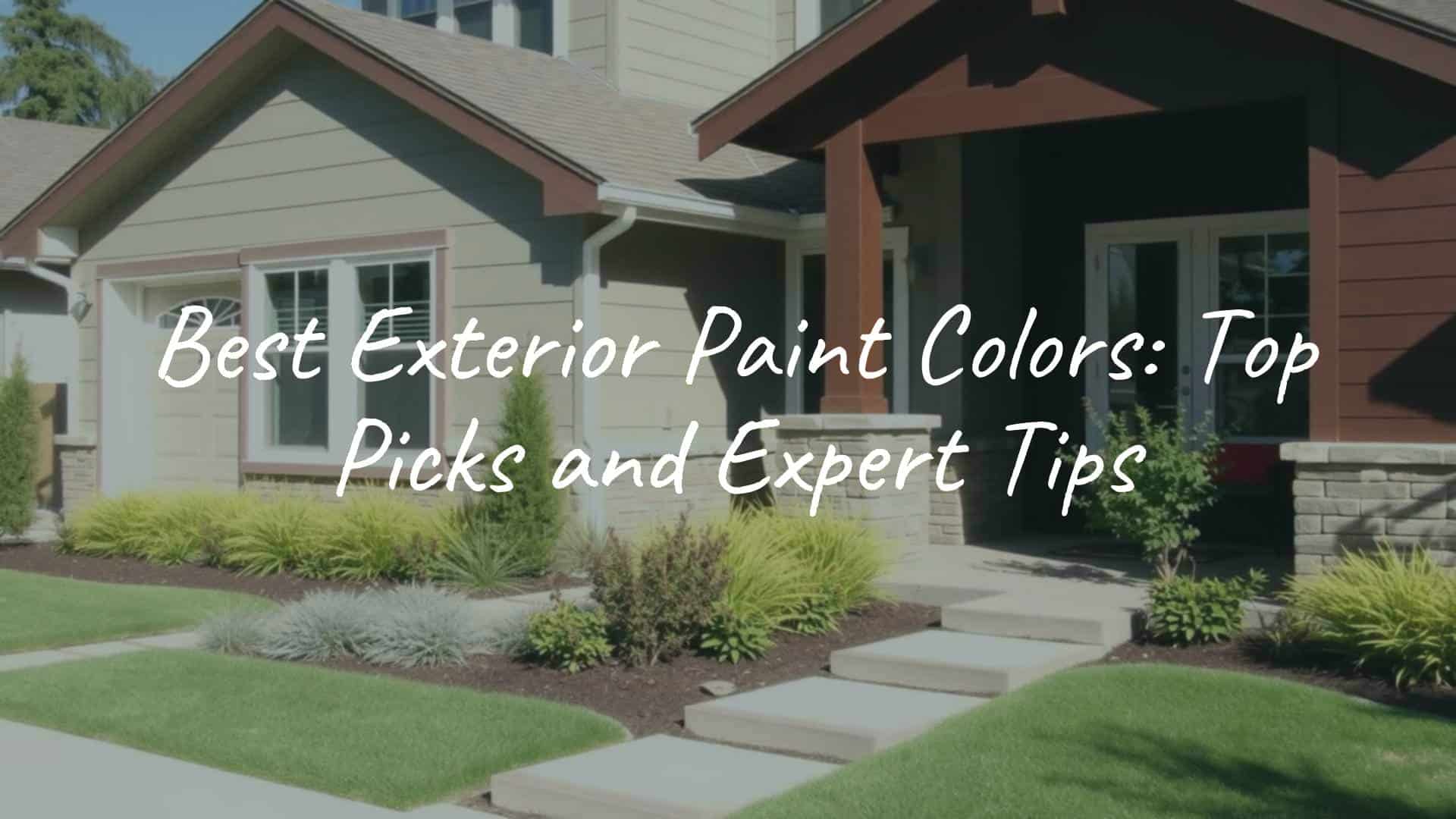
The best exterior paint colors work with your home’s style, the landscape around it, and your own taste. Color preference is personal, but long-time favorites like Benjamin Moore’s White Dove, go-to neutrals such as Revere Pewter, and bold shades like Hale Navy stay popular because they are flexible and look great from the street. For a fresh, upscale look in 2026, soft sage greens and deep chocolate browns are becoming favorite choices for a rich, grounded feel.
Choosing an exterior palette is more than picking a color chip; it affects resale value and how you feel every time you pull into the driveway. The right color can call out details-like window boxes or trim-that might otherwise go unnoticed. The wrong color can make a grand home seem smaller or out of place on the block. By mixing current styles with classic rules, you can land on a color that feels both current and long-lasting.

What Makes a Great Exterior Paint Color?
A great exterior color does more than just cover the walls; it reacts to light, shade, and the surroundings. It has to stand up to weather while holding its depth and richness. Designers often choose colors with subtle undertones so the house doesn’t look flat or plastic. A white with a touch of gray or cream, for example, almost always looks more “high-end” than a bright, stark white because it works better with natural light and shadows.
A strong exterior scheme often uses three to four colors: one for the main siding (body), one for trim, one for accents (shutters, gables), and one bold shade for the front door. This layered approach adds depth and interest. When these parts work together, the house looks “finished” and cared for, which instantly raises its street appeal.
How Climate and Location Influence Color Choices
Where you live plays a big part in how a color looks and holds up. In the Northeast, people often choose traditional color sets of black, gray, and white to suit historic homes. Coastal areas like Florida or Mediterranean-style areas in California often lean toward lighter pastels, teals, and corals that reflect strong seaside light. These regional habits are about more than taste; some colors do better with local sun strength, humidity, and weather.
Climate also guides how “warm” or “cool” your colors should be. In hot, sunny states like Arizona, dark shades such as black or charcoal can absorb too much heat, raising cooling costs and breaking down paint faster. In those spots, lighter desert tones like Subdued Sienna or Spiced Cider give a warm, sun-baked look that suits the landscape without the heat load of very dark colors.

The Role of Natural Lighting on Exterior Hues
Sunlight is one of the trickiest parts of choosing exterior paint. Outside, colors almost always look lighter and more faded than the small chip you see indoors. A medium gray can look almost white in full sun, while a dark green like Laurel Woods can read nearly black at dusk. The direction your home faces-north, south, east, or west-also changes how undertones show throughout the day.
West-facing homes are especially tricky because late afternoon light is very warm and orange. It can make cool grays look dirty and warm whites look too yellow. Many pros suggest testing large samples in both direct sun and shade. That way the color you like at 10 AM won’t become an eyesore by sunset. The way light and color interact is what makes a home feel either welcoming or harsh.
Trending Color Palettes for Today’s Homes
Heading through 2025 and into 2026, “natural” and “soft” looks are leading the way. Many homeowners are leaving behind the sharp black-and-white Modern Farmhouse contrast and moving to gentler, blended tones. Earthy sage greens like Evergreen Fog are expected to be big, since they mix easily with greenery and stone. These greens feel calm and refined, giving that “quiet luxury” feel so many people want.
Deep browns and chocolate tones-such as Tucker Chocolate or Urbane Bronze-are another rising trend. Black has been the main modern accent color for years, but rich browns now offer similar depth with extra warmth. Soft burnt orange and terracotta shades are also making a comeback in modern and Southwestern designs, bringing in a chalky, desert-style look that feels both timeless and current.

Factors Before Choosing Exterior Paint Colors
Before you buy large cans of paint, look at the “fixed” parts of your home. These are elements you don’t plan to replace, like roof shingles, brick, stone, or pavers. If your roof is a warm reddish brown, a cool blue-gray on the siding might clash. The idea is to pick a siding color that connects with a secondary tone already in your brick, stone, or roof so everything feels like one plan.
Your taste matters, but the outside of your home also affects the whole street. You want a look that shows who you are without becoming the house everyone complains about. The goal is to stand out because your colors look thoughtful and well chosen-not because they fight with everything else on the block.
Coordinating with Roof, Trim, and Accents
The key to a pro-looking exterior is how the body color and trim relate. For a classic contrast, many designers pair darker siding with a crisp white trim like White Heron or Brilliant White. This outlines the home and makes windows stand out. For a more modern, soft look, use a trim only one or two shades lighter or darker than the siding for a smooth, tonal finish.
Small details like garage doors, shutters, posts, and railings matter too. Many people match shutters to the front door, but picking a shade just a bit lighter or darker can create a nice, subtle contrast. For example, if the siding is a light neutral like Carrington Beige, a deep blue accent such as Lucerne can anchor the look. Remember, roof color is part of your palette: a gray roof works with many colors, while brown or green roofs often look best with warmer, earth-toned siding.

Blending with Your Neighborhood Aesthetic
The colors already used in your neighborhood give you helpful hints. If your area is full of colorful older homes-like in Portland or New Orleans-you can safely try brighter shades like lavender or coral. In more traditional suburbs, it’s usually smarter to stick with classic neutrals, navy, and greens to protect your home’s value.
If you have a Homeowners’ Association (HOA), check their rules and approved lists first. Many HOAs have strict color guidelines, and skipping approval can be costly. Even without an HOA, take a walk and note what neighbors have chosen. You don’t want to copy the exact shade next door, but you also don’t want a color that makes nearby homes look dirty or dull.
Accounting for Your Home’s Architectural Style
Different home styles “ask” for different color approaches. A large Colonial often looks best with a formal white body and black shutters-a look that has worked for over a century. A Craftsman or Bungalow is meant to blend with nature, so deep greens, ochres, and stained wood are ideal. These homes usually have detailed trim that can handle three or more colors without looking busy.
Modern and Contemporary homes tend to favor minimal color schemes. Using several strengths of one color-like Iron Mountain and Kendall Charcoal-draws attention to clean lines and shapes. Victorian homes, often called “painted ladies,” can use five or six colors to highlight every curve and molding, though a simpler mix like peach and cream can also be beautiful and refined.

Paint Sheen and Its Impact on Color
The finish, or sheen, of paint changes how the color looks. Low Lustre is very common for siding because it hides flaws while giving a soft glow that makes color look full. A Flat finish is great at hiding marks on older wood or stucco but is harder to wash. Satin or Pearl finishes are often used on trim and shutters since they hold up better to touching and cleaning.
For doors and special details, many designers pick Semi-Gloss or High-Gloss. A glossy front door in Million Dollar Red or deep Black Satin creates a shiny, upscale focal point. Higher sheen reflects more light, which can make a color look a bit lighter and brighter than the same shade in flat.
Most Popular Exterior Paint Color Families
Looking at color families is a helpful way to sort options. Whites and neutrals are still the most common because they feel safe and help with resale, but darker colors are now used more often on full exteriors, not just as accents. Each family sets a different mood: blues feel calm, yellows feel happy, and greens feel connected to nature.
Paying attention to undertones is key. A gray often isn’t a true gray; it may lean blue, green, or purple, which becomes clear on a big wall. By grouping choices into families, you can better guess how they’ll feel once your house is painted.
Classic Whites and Off-Whites
White makes a clean backdrop so your architecture and landscaping stand out. White Dove (OC-17) is a long-time favorite because it’s bright without being harsh, thanks to a soft, creamy base note. Warm whites like Alabaster or Swiss Coffee give a cozy, welcoming feel that suits Farmhouse and Traditional homes and can make a house seem larger and more open.
Picking the wrong white can be a big mistake. A very cool white can look blue and “hospital-like” in some light, while an overly warm white can look yellowed or dirty. Simply White is a popular bright option that works on both body and trim, and Chantilly Lace offers a sharp, crisp look that pairs well with black metal and modern details.

Timeless Grays and Greige Shades
Grays and “greiges” (gray plus beige) are reliable choices for many exteriors. They look refined and friendly and don’t go out of style quickly. Revere Pewter is a classic neutral that sits right between warm and cool, so it fits different settings easily. Medium grays like Coventry Gray give a clean, straightforward gray with a slight blue cast that feels calm and polished.
Greige works well because it shifts gently with the light. Shades like Agreeable Gray or Pale Oak offer a soft, upscale background that looks expensive without shouting. They are great for traditional homes when you want something easier to keep clean than pure white, and they combine nicely with navy, black, or natural wood doors.
Earthy Greens and Sage
Green is back in a big way as homeowners want more natural, outdoor-friendly looks. Earthy greens like Louisburg Green or Hampshire Gray (a gray-green) work beautifully on homes with lots of trees or landscaping. Sage green is especially popular for 2025/2026 because it’s soft enough to feel neutral but still has character.
Deeper greens like Caldwell Green give a rich, classic feel that looks great on stucco or brick. With green, think about your plants and trees-you want the house and yard to work together, not blend into one blob. A sage body with creamy white trim and a warm wood door offers a calm, balanced look that quickly boosts curb appeal.
Bold Blacks and Charcoals
Dark exteriors are no longer just for ultra-modern homes. Strong, deep colors like Black Satin, Iron Mountain, and Off-Black create stylish, eye-catching houses. A dark home really stands out on a typical street, especially with bright green grass or landscaping around it. These shades often feel cozy and grounded rather than stark.
If full black seems too strong, colors like Kendall Charcoal or Charcoal Slate give a softer, smoky feel while still staying dramatic. They look especially high-end with white trim or warm metal fixtures in brass, gold, or copper. Dark exteriors also help highlight strong architectural lines.

Warm Neutrals and Beiges
For a welcoming look, warm neutrals such as Shaker Beige and Accessible Beige are very reliable. They mix well with many accent colors-deep greens, blues, or reds-and bring a sense of comfort and tradition. They are especially popular for suburban and ranch-style homes.
Newer neutrals like Carrington Beige, with a slight green cast, feel current compared to the flat “builder beige” used years ago. These tones work well on stucco and can give a soft, sunlit Mediterranean feel. Paired with crisp white trim, they look clean and intentional, not outdated.
Inviting Blues and Navy
Blue often ranks near the top for exterior colors because it feels calm and friendly. Hale Navy is one of the most-loved navy shades: classic, rich, and upscale. It can make a house look more valuable and carefully maintained. Lighter blues like Gossamer Blue or blue-grays like Boothbay Gray give a breezy, coastal feeling.
Blue homes with white trim form a classic American look that works in beach towns and suburbs alike. For something more modern, deep teals like Deep Sea Dive with dark wood or red accents can create a strong, memorable front without feeling loud.
Sunny Yellows and Rich Browns
Yellow is bright and happy but must be chosen with care so it doesn’t look like a school bus. Soft, toned-down yellows such as Concord Buff or Hawthorne Yellow give a gentle glow that’s great for cottages and traditional homes. With white trim, yellow feels crisp, clean, and sunny year-round.
Rich browns are gaining ground on black and gray. Colors like Wenge, Black Bean Soup, and French Press create a dark, wood-like look that feels bold and upscale. These chocolate tones are perfect for modern houses and rustic barndominiums, adding warmth and depth where gray might feel flat.

Accents: Reds, Blues, and Unexpected Pops
The front door is your best spot for a fun splash of color. Million Dollar Red or Caliente work beautifully on white or black houses, creating an inviting focal point. Soft pink, periwinkle, or bright orange are also gaining fans as people look for small ways to show personality.
Shutters and gables are other easy places to experiment. A turquoise door with gray-blue shutters can lift a modern home, while a deep purple-brown door adds interest to a neutral, earthy scheme. Since these accents are relatively simple to repaint, they’re good places to try current trends.
Best Exterior Paint Colors for Different Home Styles
Matching your colors to your home’s architecture is a reliable way to get a polished look. The shape and design of your house tell you where darker or lighter colors will work best. Taller, narrow homes often benefit from darker shades that “ground” them. Lower, spread-out ranch homes usually look better in light tones that make them seem larger.
Whether you’re updating an old Colonial or finishing a new modern build, the idea is to respect the home’s character. Many designers lean on historic color lines like Benjamin Moore’s Historical Collection for shades that have worked on American homes for many years.
Craftsman and Bungalow
Craftsman homes are known for detailed woodwork, wide porches, and strong links to nature. For these, muted natural tones work best. Olive greens, warm ochres, and deep browns highlight wood details and heavy trim. A classic combo is Renwick Olive for the body, Cut the Mustard for accents, and a stained wood door.
Bungalows also shine in natural colors. A gentle pine green body with sky blue accents and creamy white trim can make these smaller homes feel like inviting retreats. Avoid very bright, synthetic colors that compete with stone, brick, and wood-materials that are central to the Craftsman look.
Modern and Contemporary
Modern homes tend to favor neutral, simple palettes that let the structure itself stand out. Using multiple grays or blacks in one scheme gives a layered, stylish look. Kendall Charcoal and Iron Mountain are favorites for creating a moody, high-end feel. Many of these houses also look great in pure, bright white, which highlights sharp lines and bold shapes.
Some modern designs use strong color only in small areas. A Canary Yellow feature wall or bold turquoise door can soften dark gray siding and add a playful note. All-black exteriors are also trending, giving a bold, modern presence that stands out in any area.
Colonial and Traditional
Colonial-style homes are known for symmetry and formality. The classic white body, black shutters, and red door combination still works extremely well. White Dove or Simply White are excellent siding choices, while a deep black on shutters and trim keeps the look sharp and proud.
Traditional homes also wear deep blues beautifully. A Hale Navy body with Oxford White trim and a red front door gives a refined take on red, white, and blue. Because these homes often have balanced fronts, using lighter siding with darker accents helps highlight that symmetry.
Farmhouse and Cottage
The Modern Farmhouse style has turned Pure White and Simply White into nationwide favorites. These homes use bright, clean exteriors for a cheerful look. White siding with black windows and a green or blue door adds modern contrast while still feeling rustic and homey.
Cottages can carry more playful shades. A pale yellow cottage with white trim and blue-gray details feels very “Cape Cod.” Soft pinks, seafoam, and aqua tones also look great on these homes, especially with informal gardens, climbing vines, and brick or stone paths.
Mid-Century and Ranch
Mid-century modern homes usually mix brick, wood, and glass. Colors like Calm (a soft white) or Boothbay Gray (a gray-blue) highlight the long, low lines without overwhelming the materials. Because these houses often have big windows, it helps if the exterior color suits the interior style too.
Ranch homes work well with warm neutrals and greige tones. Being single-story, they benefit from light colors that visually lift the structure. A desert ranch looks great with a white exterior, dark brown trim, and any accent color you like in furniture, planters, and doors.
Designer-Recommended Exterior Paint Combinations
If you feel lost facing rows of color chips, starting with a designer-tested combination can make things easier. These sets are chosen so the undertones of body, trim, and accents work together in many types of light and weather.
Most follow the “rule of three”: a main siding color, a trim color, and a third, bolder shade for the “jewelry” of the house-usually the front door. Here are five strong combinations that suit many home styles.
White with Black Trim and Red Door
This mix may be the most classic American exterior scheme. It’s bold, formal, and never feels out of date. A soft white like White Dove keeps the home from looking overly bright, while deep black like Black Satin on shutters and trim creates a crisp outline. The Million Dollar Red door becomes a friendly focal point.
This palette works especially well on Colonials, Farmhouses, and cottage-style homes. It stays popular because it feels both historic and current. The black features balance the white siding and give the house a solid, well-built look.
Gray with Navy Blue Accents
For a cool, coastal feel, pair a medium gray body with navy accents. Coventry Gray on the siding with Hale Navy on shutters and the front door gives a calm, polished look. It’s common in seaside areas but looks just as good inland, especially around stone or brick features.
Gray and navy is a safe but stylish pairing. It’s softer than black-and-white, with a smoother shift between shades. Add crisp white trim to separate the two darker colors and keep the house looking clean and layered.
Sage Green with Cream and Warm Brown
This palette fits right into current “natural” trends. A sage green like Evergreen Fog for the body blends with plants and trees, while a creamy trim like White Chocolate adds light and contrast. A warm brown or stained wood door finishes the look and ties it to the landscape.
This set is a nice change from standard grays and beiges and feels more personal and relaxed. It’s perfect for Craftsman homes, bungalows, and houses surrounded by woods or gardens. The cream trim keeps the home bright without the sharpness of pure white.
Earthy Taupe Paired with Slate and Mossy Green
For “Grand Traditional” or Tudor-style homes, an earthy taupe main color with slate gray and moss green accents looks very refined. Tavern Taupe sets a soft, neutral base, while slate-colored trim adds depth. A door or shutters in Wethersfield Moss add just enough color while still feeling natural.
This combination works especially well on textured exteriors like stucco or cedar shakes. It lines up nicely with natural surroundings, bringing a sense of calm and comfort without feeling plain or boring.
Sunny Yellow with Pure White Trim
If you want the happiest house on the block, choose a soft, sunny yellow with white trim. Hawthorne Yellow provides warmth without screaming for attention. Paired with Simply White trim, the result is neat, bright, and inviting.
This pairing suits cottages and 1920s homes especially well. For a fun extra, paint the porch ceiling a light “haint blue” or gray-blue such as Fountain Spout. It’s a small touch that adds charm guests notice as soon as they step up.
How to Test and Sample Exterior Paint Colors
Choosing an exterior color from a tiny chip is one of the biggest mistakes you can make. Exterior painting often costs $10,000-$30,000 or more, so testing is a must. Light, trees, shadows, and even nearby houses can all change how a color appears.
Sampling gives you confidence. It’s the only real way to see the true undertones. A shade that looks like a pure neutral in the store may turn purple or green once the sun hits it across a full wall.

Ordering and Applying Paint Samples
Most major brands like Benjamin Moore and Sherwin-Williams sell 8 oz. sample jars. Designers often advise against painting these directly on your siding, since you could end up with messy patches that show through later. Instead, paint large white foam boards.
With foam boards, you can move your samples to different areas: near brick, next to the roof, or by shrubs and trees. This lets you see how the color reacts in many spots without marking up the house. Peel-and-stick samples from companies like Samplize are another easy choice; they’re big, use real paint, and don’t create any mess.
Evaluating Colors in Natural and Artificial Light
Once your boards or samples are ready, check them at three main times: morning, midday, and evening. Morning light is cooler and slightly blue. Midday sun is strong and can wash out lighter shades. Evening “golden hour” light warms everything up and can pull out yellow or red notes you didn’t notice earlier.
Look at the color in shade too. Under trees or overhangs, paint can look darker and dirtier. Choose a shade you like all day long. If it only looks good at one time and feels wrong at others, move on to a different color.
Tools and Visualizers for Previewing Paint Choices
Digital tools make planning much easier. Apps like the Benjamin Moore Color Portfolio let you upload a photo of your house and “paint” it virtually. This is a helpful way to see if a bold idea-like a black exterior-fits your home’s style before you buy paint.
These tools are not perfectly accurate because screens vary, but they are useful for narrowing choices. They can help you see whether a warm white or cool white feels better or how a navy door would look with your existing brick. After you narrow down to two or three options, switch to real samples on boards.
Tips for Achieving Long-Lasting and Beautiful Results
The color you pick is only half the story; paint quality and surface prep control how long it looks good. Exterior paint has to fight off sun, rain, wind, and temperature swings. Higher-end paints usually last longer, so you repaint less often and save money over time.
Good prep is the hidden step that separates average jobs from great ones. Even the best paint will fail if it goes over dirt, mildew, or peeling layers. Regular care after painting also keeps your “freshly painted” look going for many years.
Selecting High-Quality Exterior Paint Brands
For exteriors, the brand and specific product line matter a lot. Benjamin Moore’s Aura Exterior is a top-level choice known for its strong color and durability. For wet or humid areas, lines like Element Guard or Regal Select include mildew-fighting features and resist rain soon after application.
Sherwin-Williams also sells high-build exterior paints that can fill small cracks in fewer coats, which is helpful on older wood and masonry. If your home has vinyl siding, make sure you pick a “Vinyl Safe” line so dark colors don’t cause the siding to warp in the sun. Ask your local paint shop which product is best for your type of surface, whether it’s wood, stucco, brick, or fiber cement.
Preparing Surfaces for Even Coverage
Prep work is most of the job. Clean the whole exterior with a power washer to remove dirt and chalky residue, then scrape off any loose paint and sand rough spots. Replace rotten trim and fill gaps or cracks around windows and doors with good caulk. This prevents water from getting behind the new paint and causing bubbles or peeling.
Some surfaces, like stucco and brick, need special primers to deal with their high pH and rough texture. For instance, if you’re painting stucco a creamy white like White Chocolate, proper priming helps the color soak in evenly and last longer. Doing this prep helps your chosen color look smooth and rich once applied.
Maintaining Painted Exteriors Over Time
After your exterior is painted, a small amount of regular care pays off. Many pros suggest power washing once a year to remove dirt, pollen, and pollution that dull color. Watch for small cracks or variations in sheen and touch them up early to avoid larger problems. Trim trees and bushes so they’re not rubbing directly on the siding.
Good exterior jobs often last 7-10 years, though strong sun or harsh climates can shorten that span. If you see chalking-a powdery film on the surface-it’s a sign the coating is wearing down and repainting is coming due. Staying on top of small issues helps your home keep that “freshly painted” look for many years.
Frequently Asked Questions about Exterior Paint Colors
What is the most timeless exterior paint color?
White is often seen as the most timeless exterior color. It has been used on homes for centuries and still feels current. Off-whites like White Dove and Alabaster are especially popular because they look classic and clean without feeling harsh. Gray and navy also hold up very well over time and support strong resale value.
The long-term appeal of a color often comes down to undertones. Balanced neutrals that don’t lean too far into a trend color age better than very “of the moment” shades. Colors that feel natural and connected to the landscape usually stay attractive longer than very bright or synthetic-looking tones.
Should front doors and shutters match?
They can match, but they don’t have to. Matching the door and shutters is a traditional, neat choice. Many homeowners like the simple, unified look. But using slightly different shades-or even different colors that still relate-can add depth and style.
For instance, you might paint your house white with black shutters and a Million Dollar Red door. Here, the shutters act as the visual base, and the door adds excitement. Just keep all your colors in roughly the same “temperature”-all warm or all cool-so they feel like part of the same family.
Can you paint vinyl, brick, or stucco exteriors?
Yes, you can paint vinyl, brick, and stucco if you use the right products and prep them properly. For vinyl siding, use “Vinyl Safe” formulas to avoid warping. For stucco, choose a breathable acrylic paint like Element Guard so moisture doesn’t get trapped. Brick can be painted or limewashed when you want to change an old red brick look.
Painting these materials is often cheaper than replacing them. A coat of Simply White on old vinyl or a creamy White Chocolate on stucco can make a house look almost new, at far less cost than re-siding. Just keep in mind that once you paint brick or stone, you’ll need to maintain that coating over time.
How often should you repaint a house exterior?
In general, most homes need repainting every 7-10 years. This range depends on your climate, how much sun the house gets, the quality of previous paint, and the type of siding. Homes in intense sun or coastal areas with salt and humidity may need new paint every 5-7 years.
Wood siding usually needs more frequent care than brick or fiber cement. If you notice peeling, cracking, or chalking, it means the current paint is breaking down. Repainting while problems are still minor can save you money on repairs and extra prep work later.
Final Thoughts on Finding the Best Exterior Paint Colors
Picking the best exterior color involves both creativity and practical thinking. You have to look past the paint chip and think about how the color will age, how it handles sunlight, and how it fits with other homes nearby. The decision can feel stressful because of the cost and effort, but a new exterior color is one of the most rewarding upgrades you can make. Fresh paint does more than protect siding-it changes how it feels every time you come home.
Color also carries emotion. A house in your favorite blue or a soft sage green can give you a quiet sense of pride. Don’t be shy about showing your personality, especially with smaller accents like your front door. In the end, your home should reflect you. By using quality products, testing carefully, and choosing a thoughtful palette, you can enjoy a “blue beauty,” a “stately white,” or any other signature look for many years.


![What to with Scrap Metal? [infographic]?](https://facts-homes.com/wp-content/uploads/2019/07/645413-POPYOV-391-120x86.jpg)


